Re-brand and store concept for a Norwegian eyewear brand.
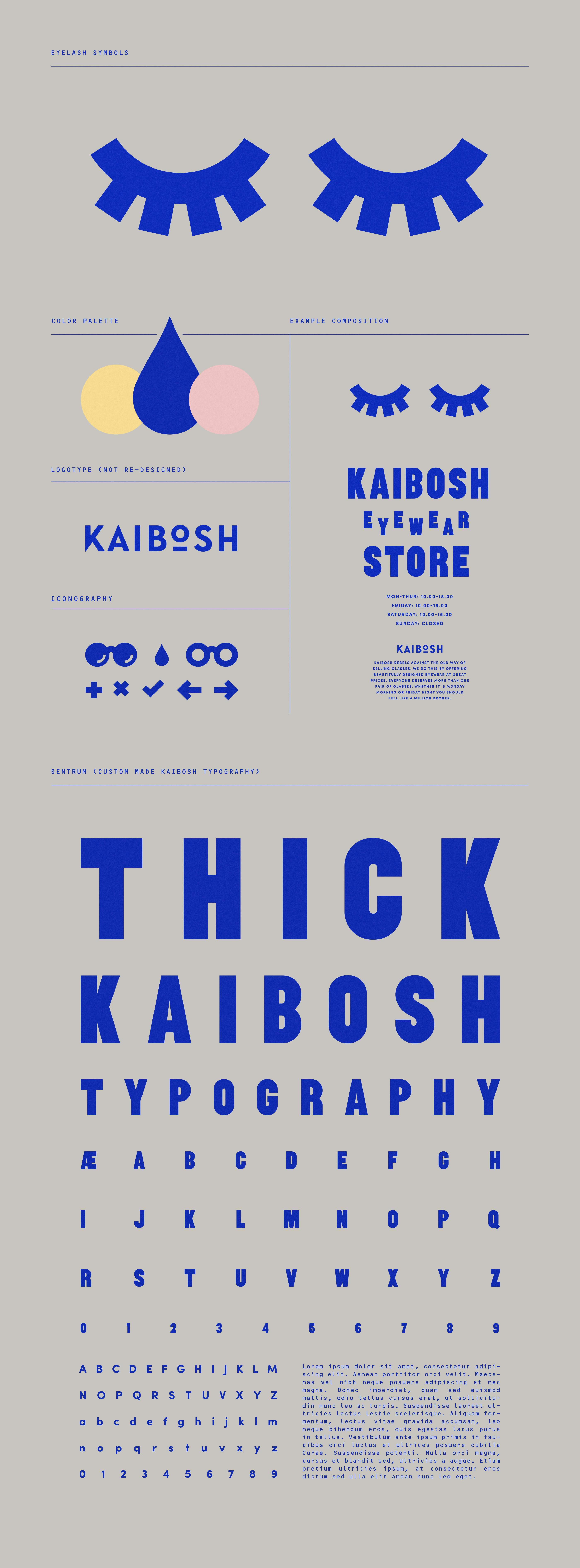
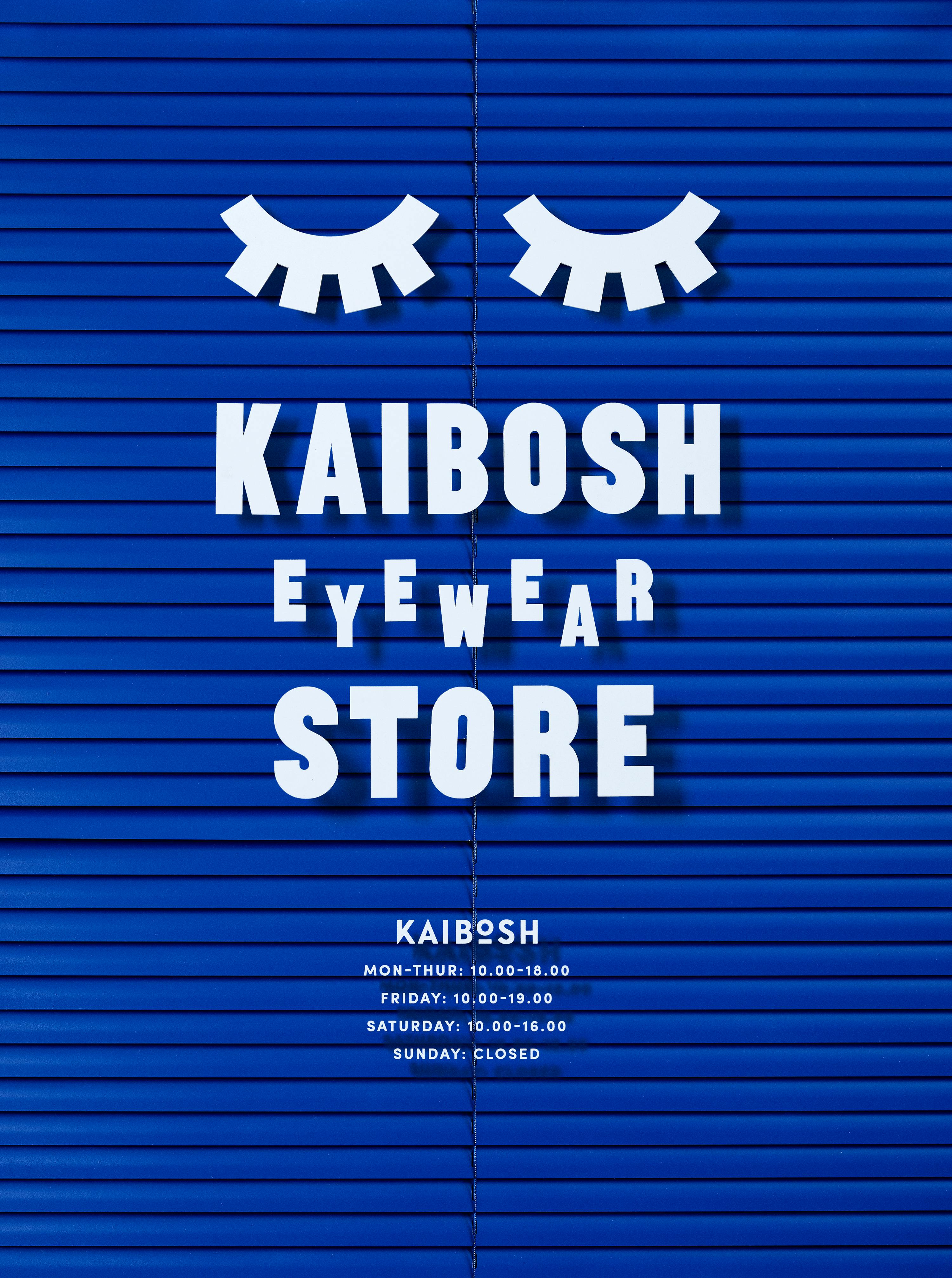
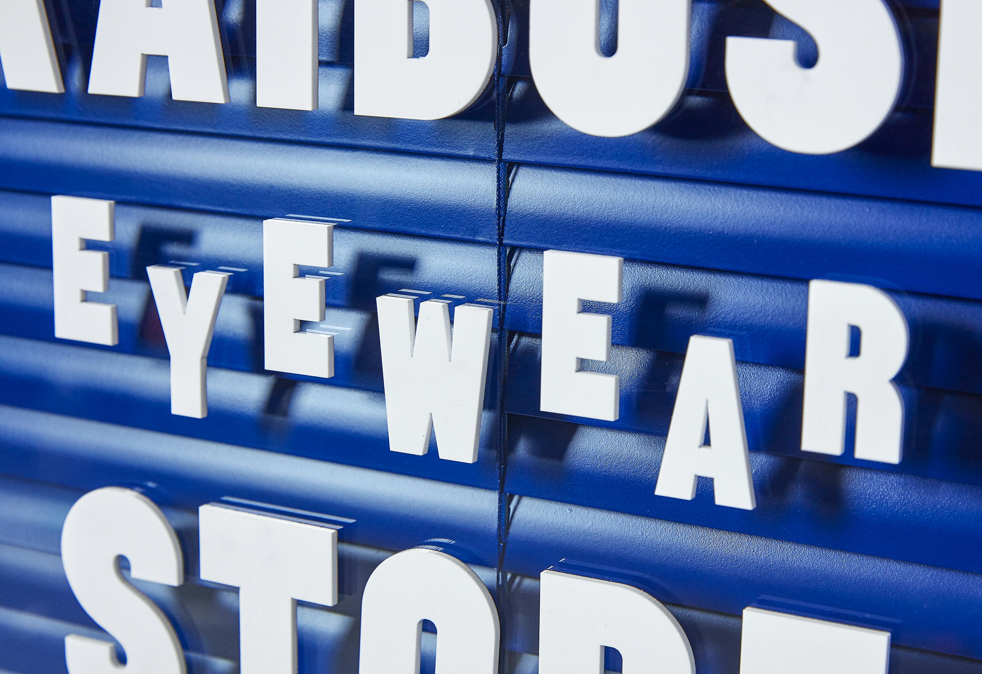
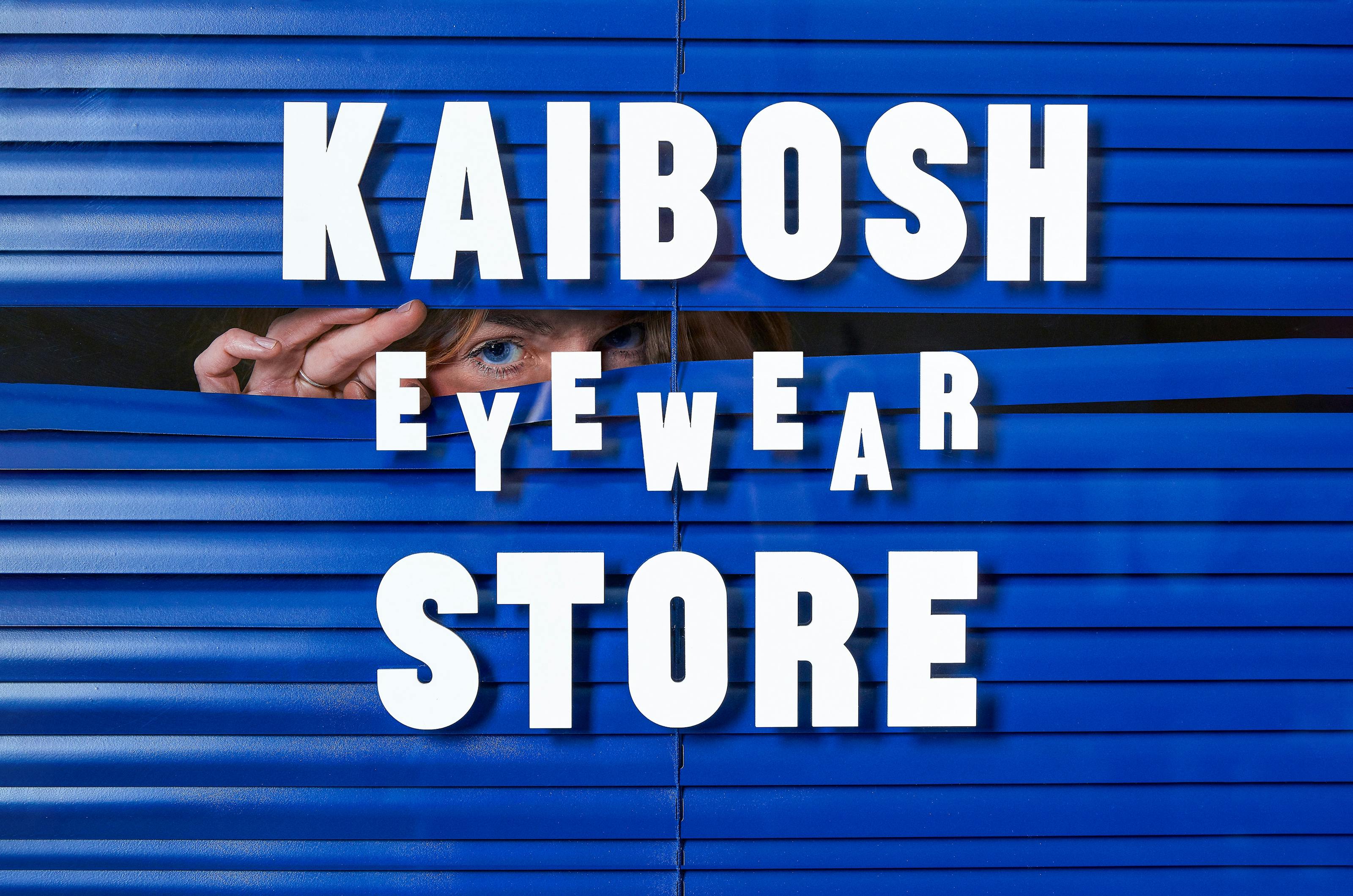
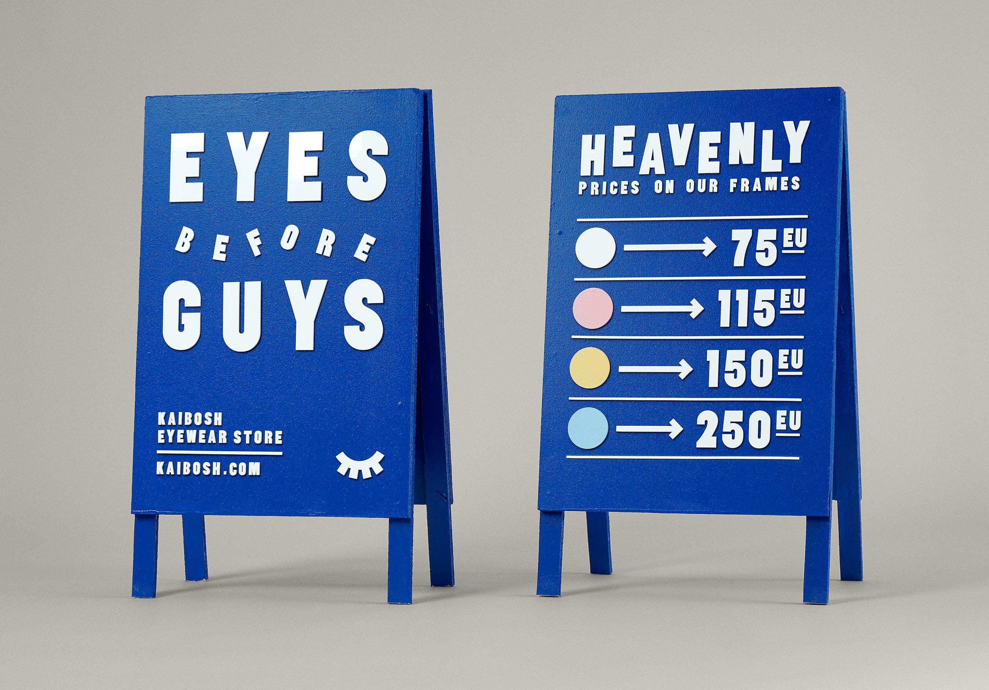
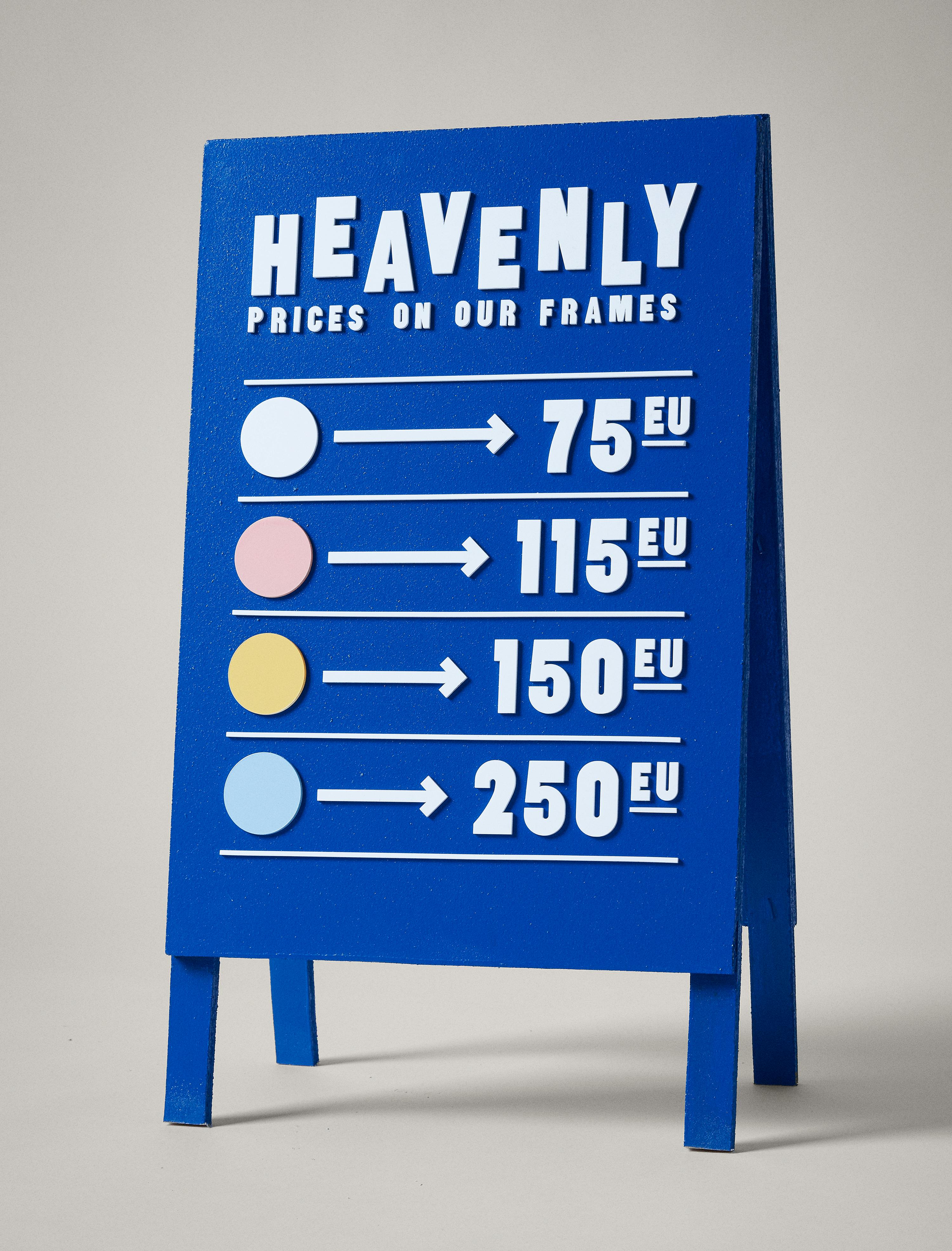
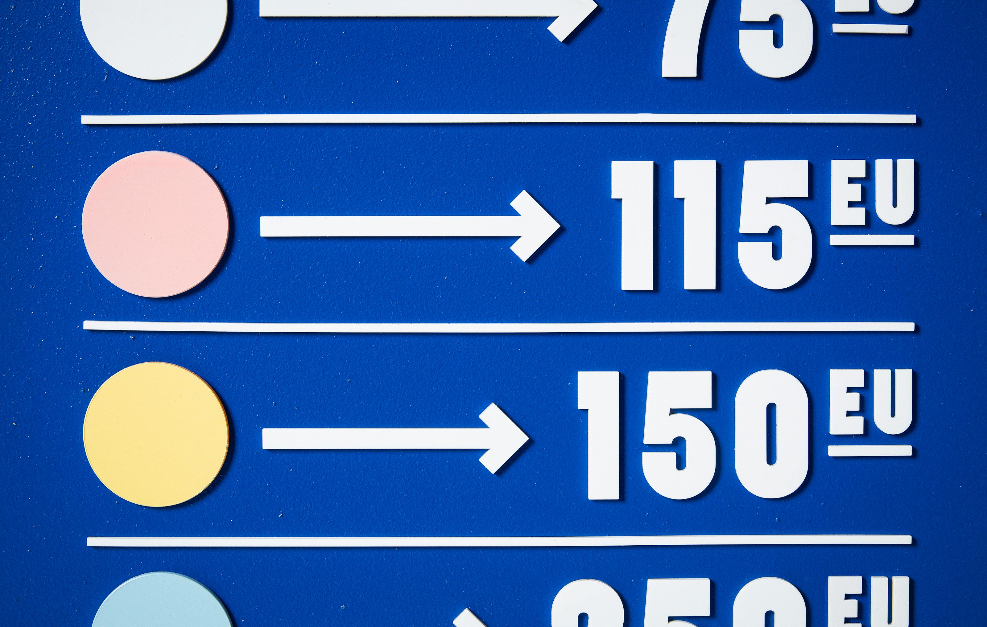
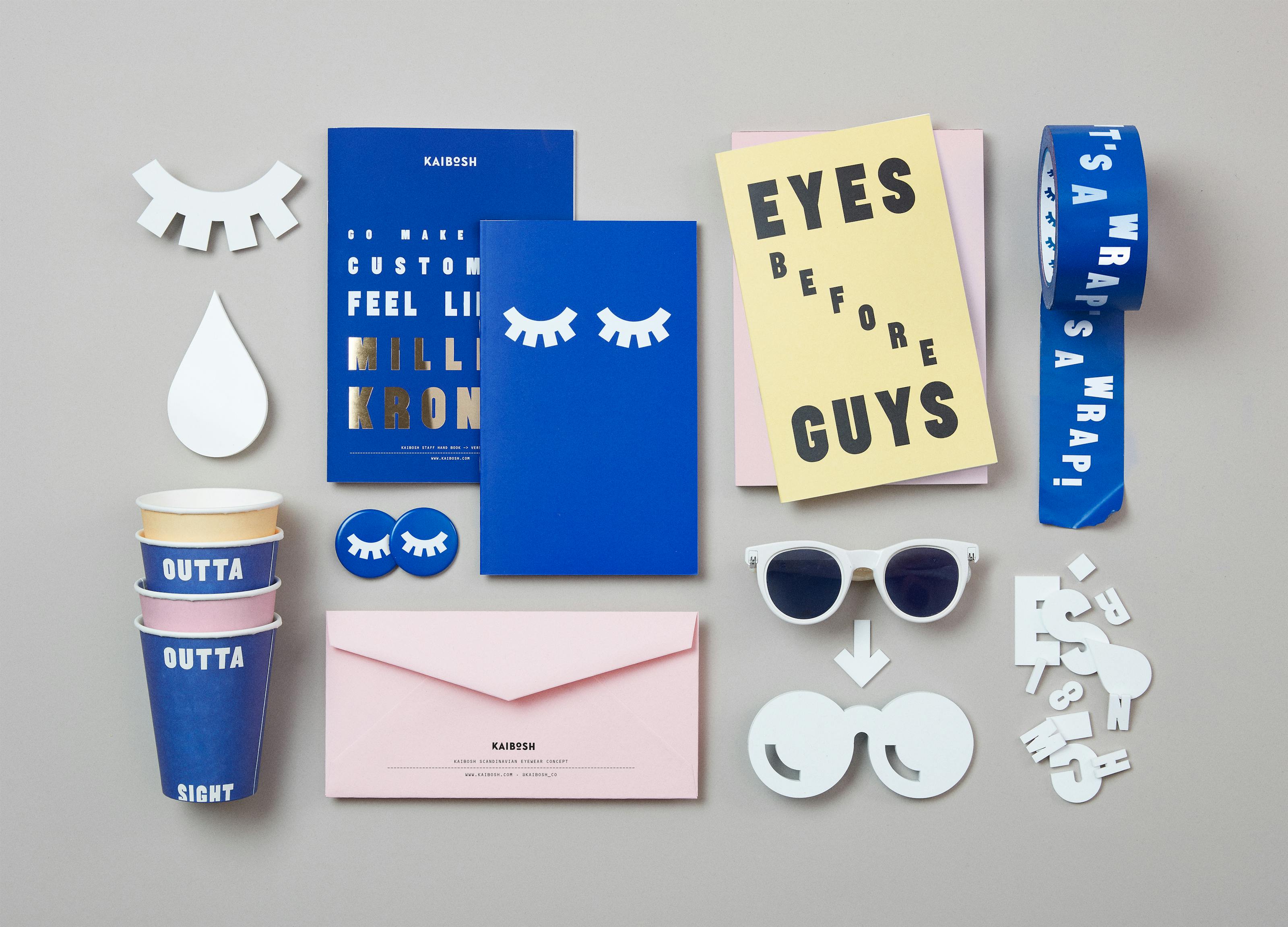
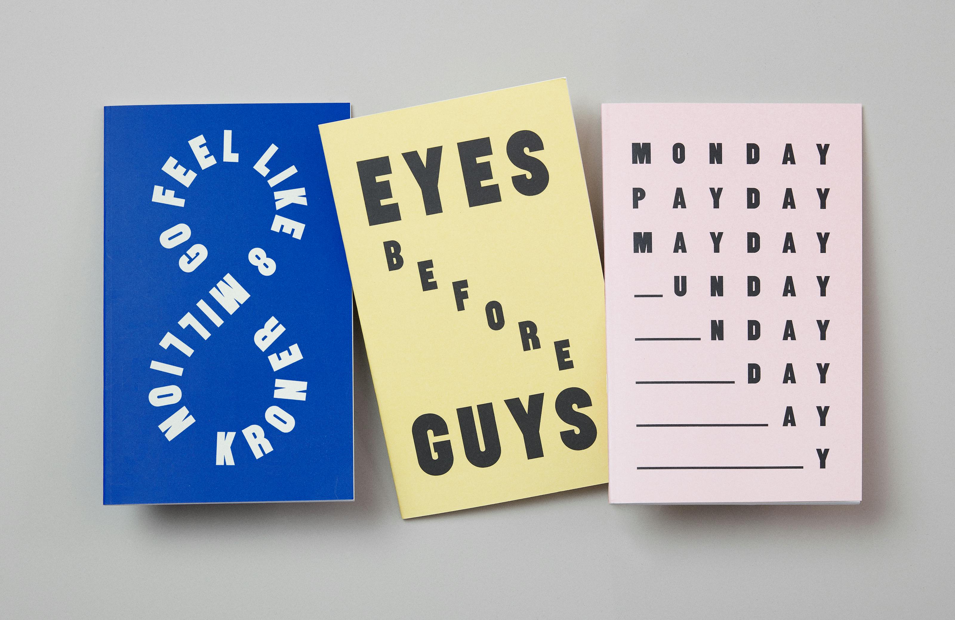
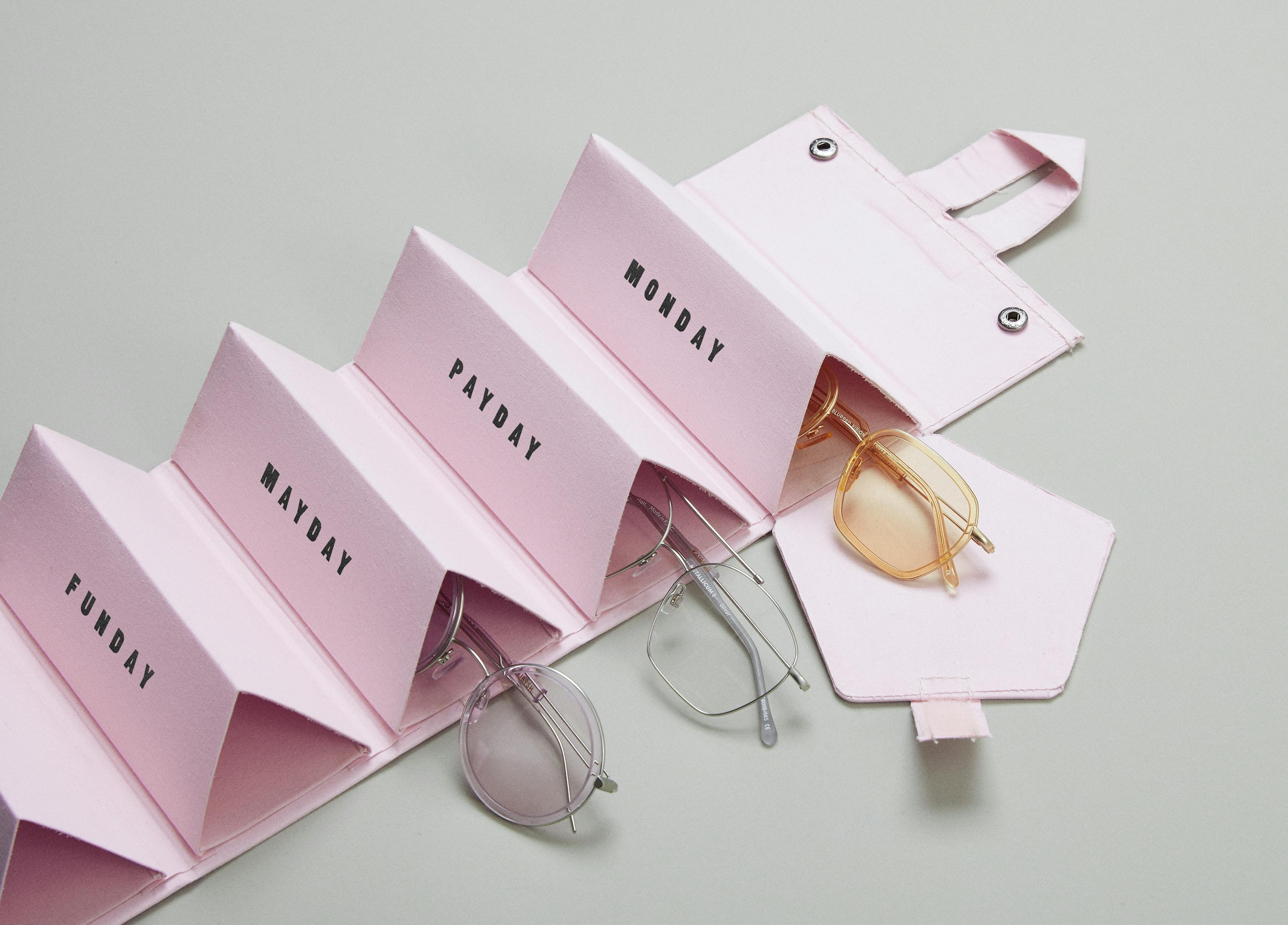
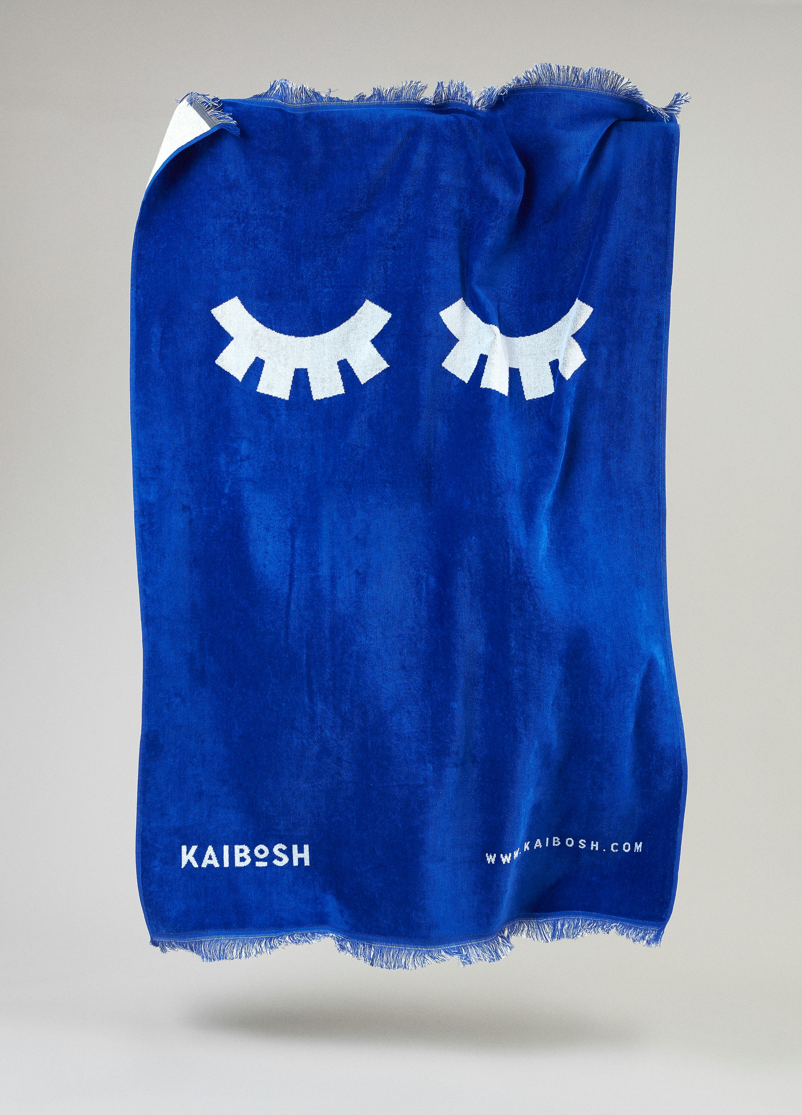
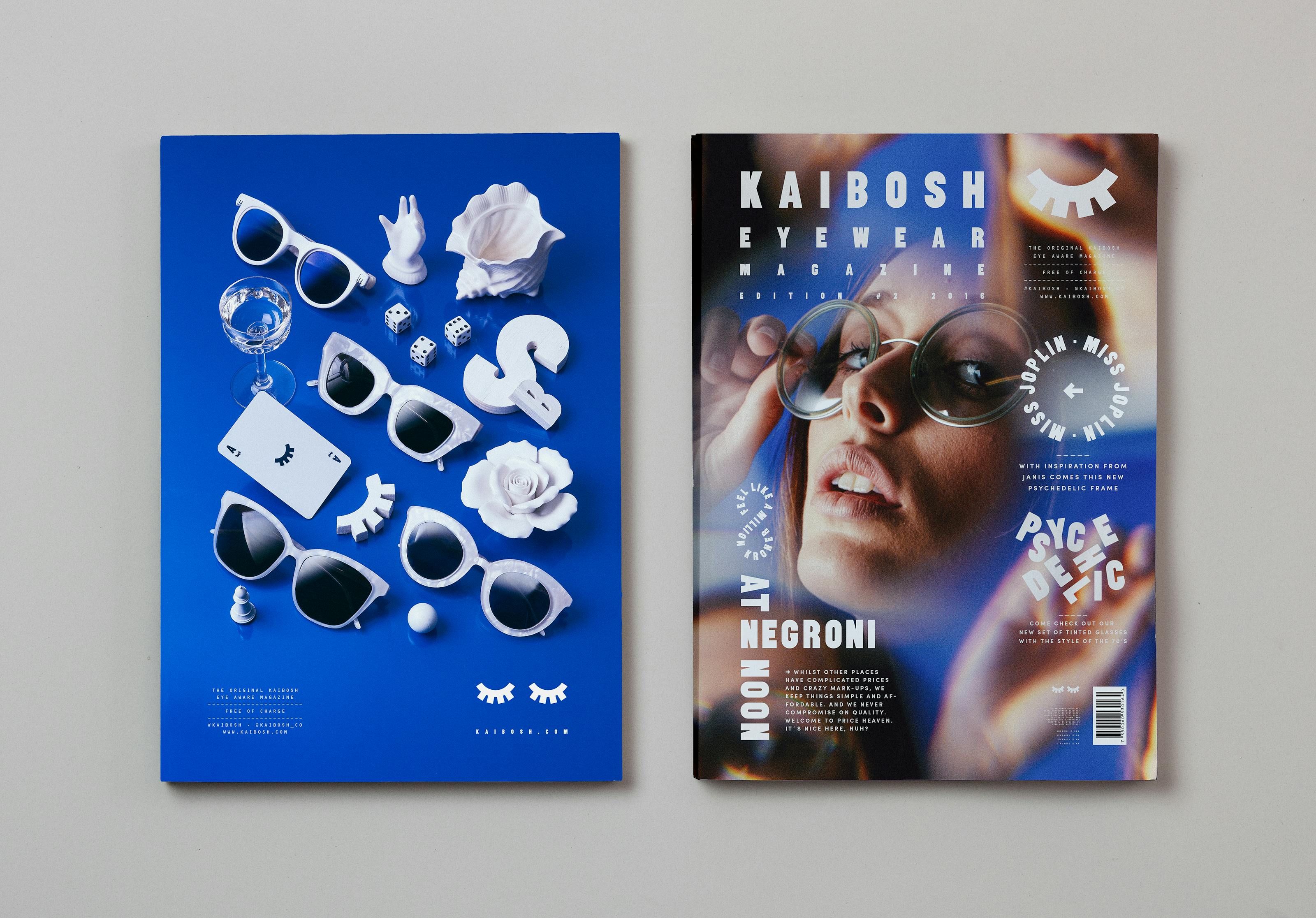
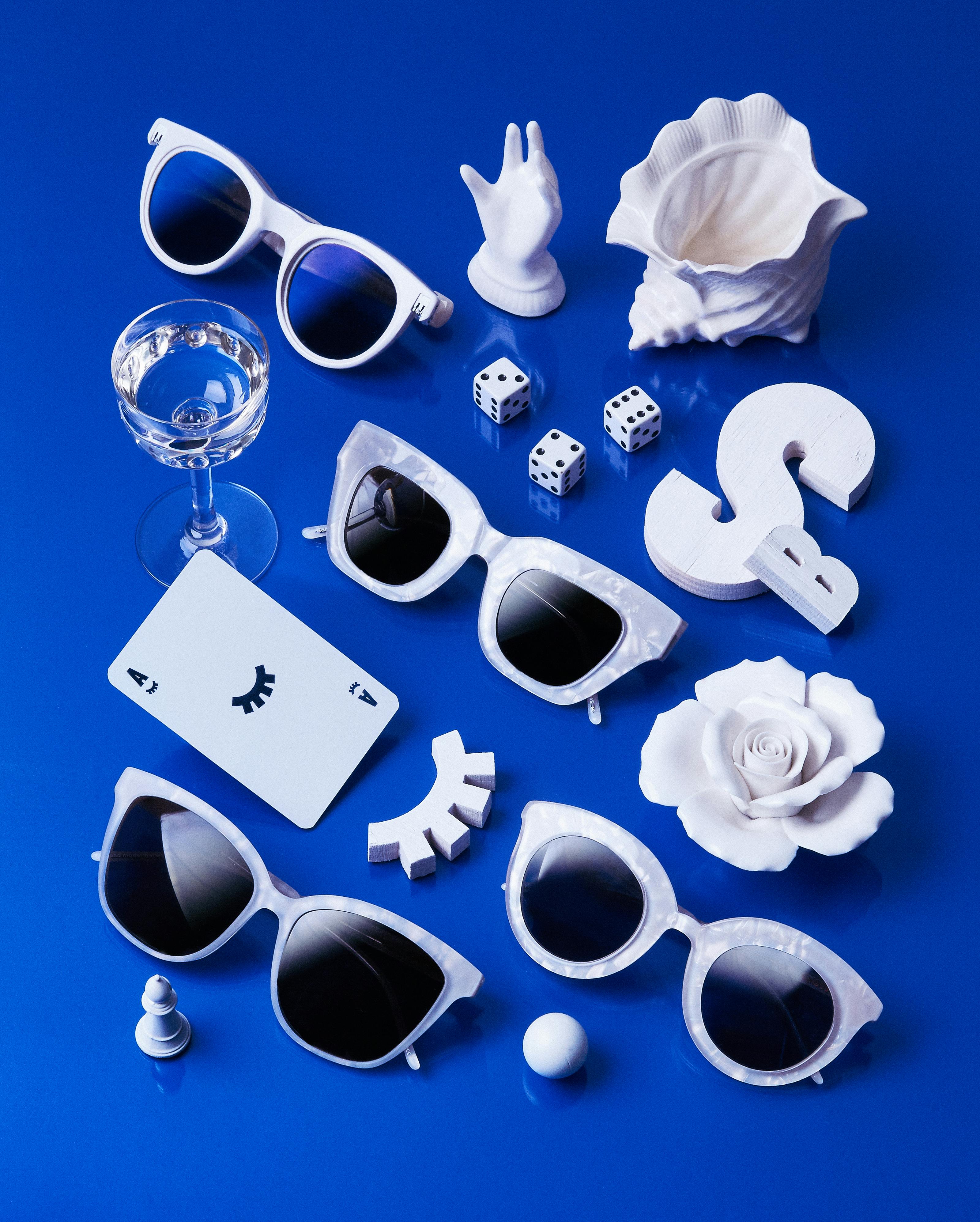
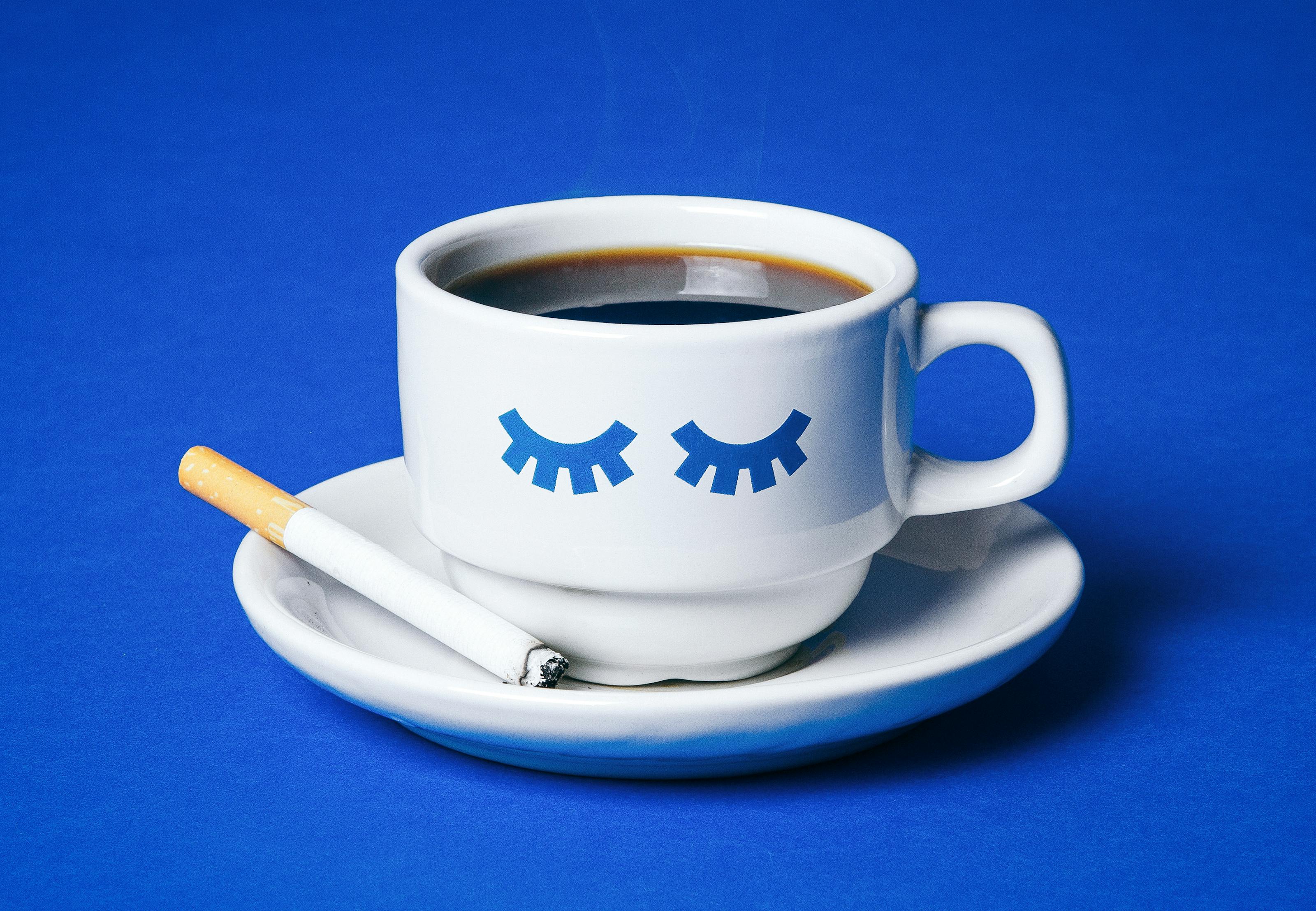
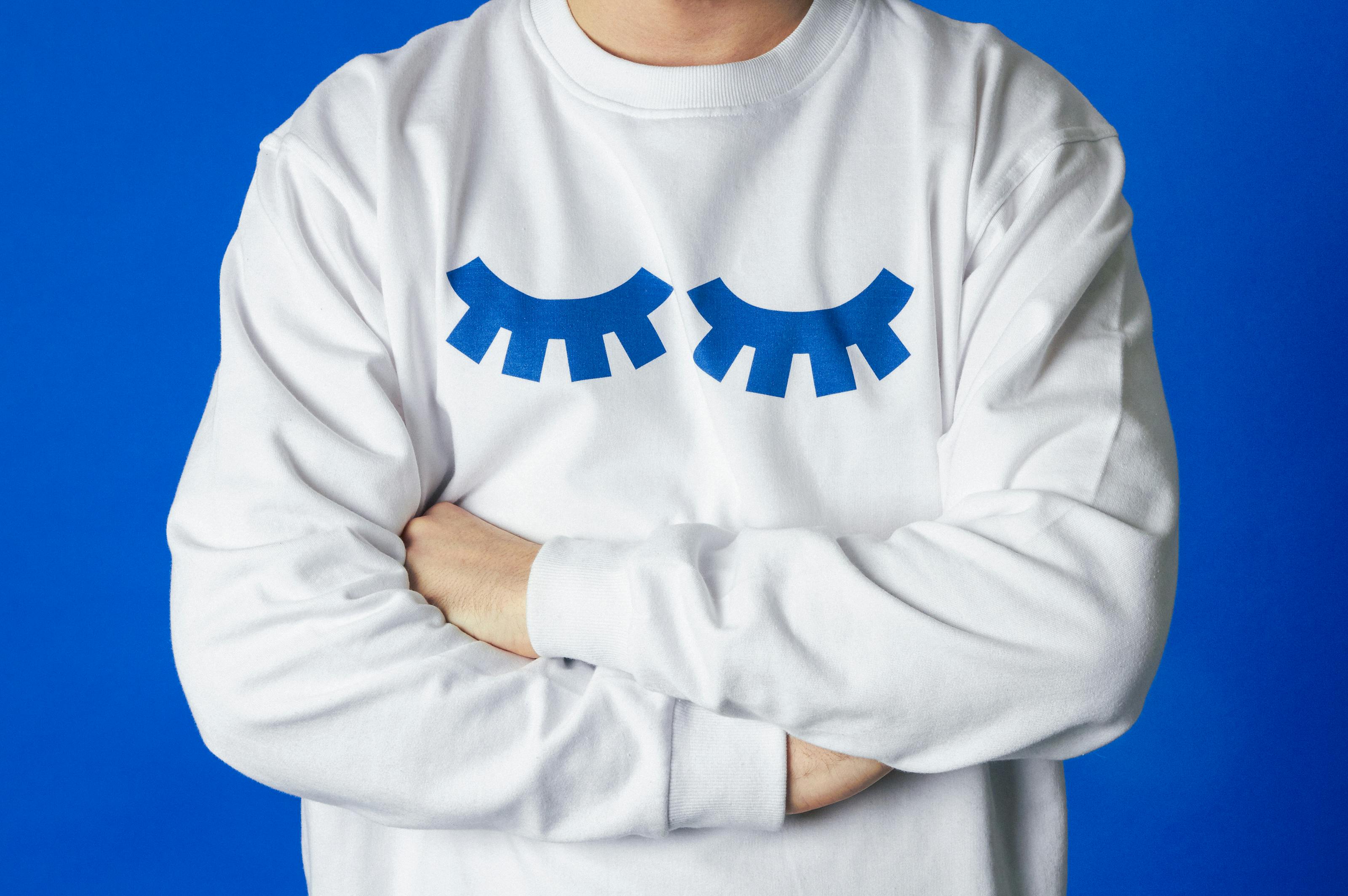
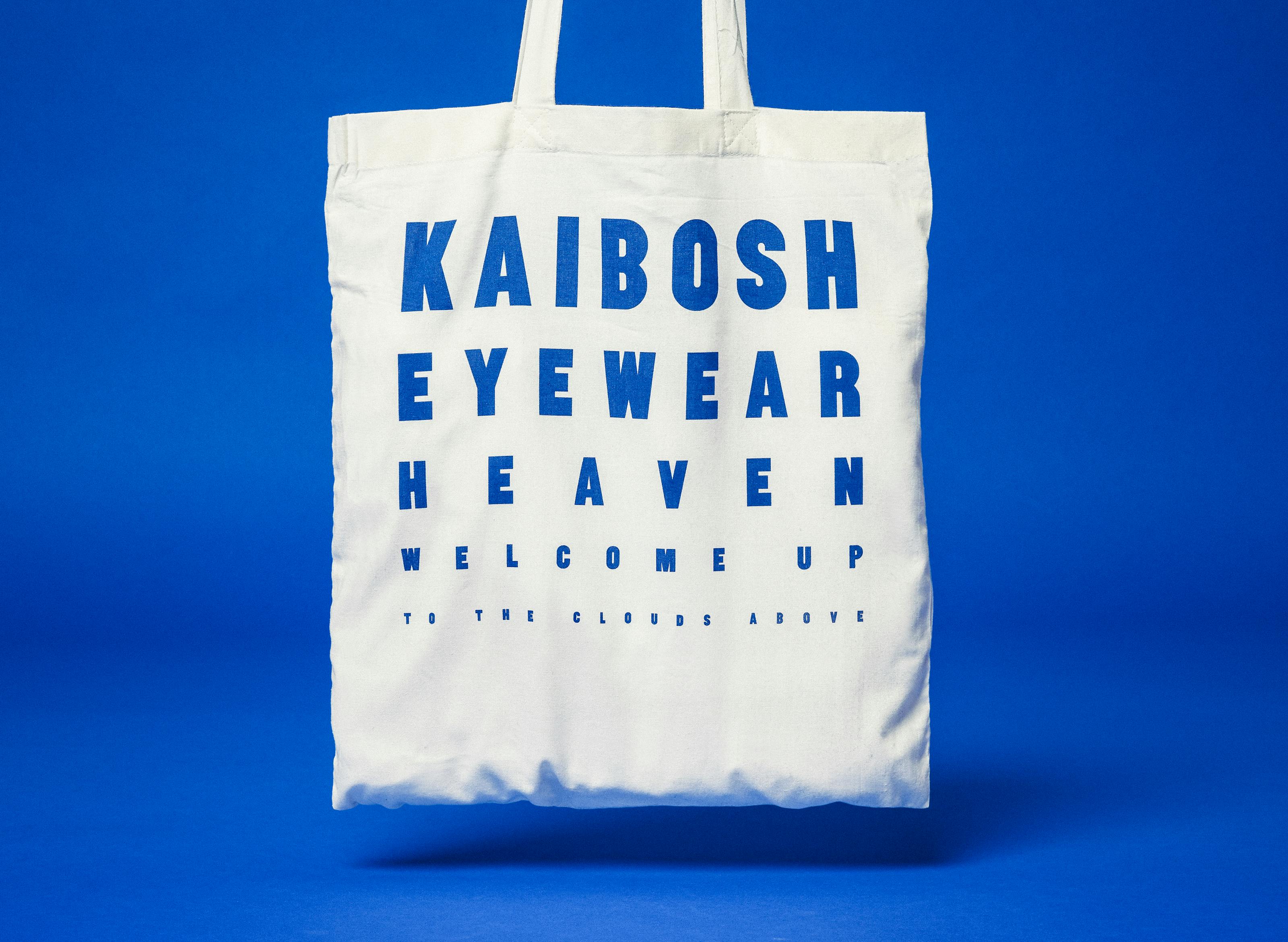
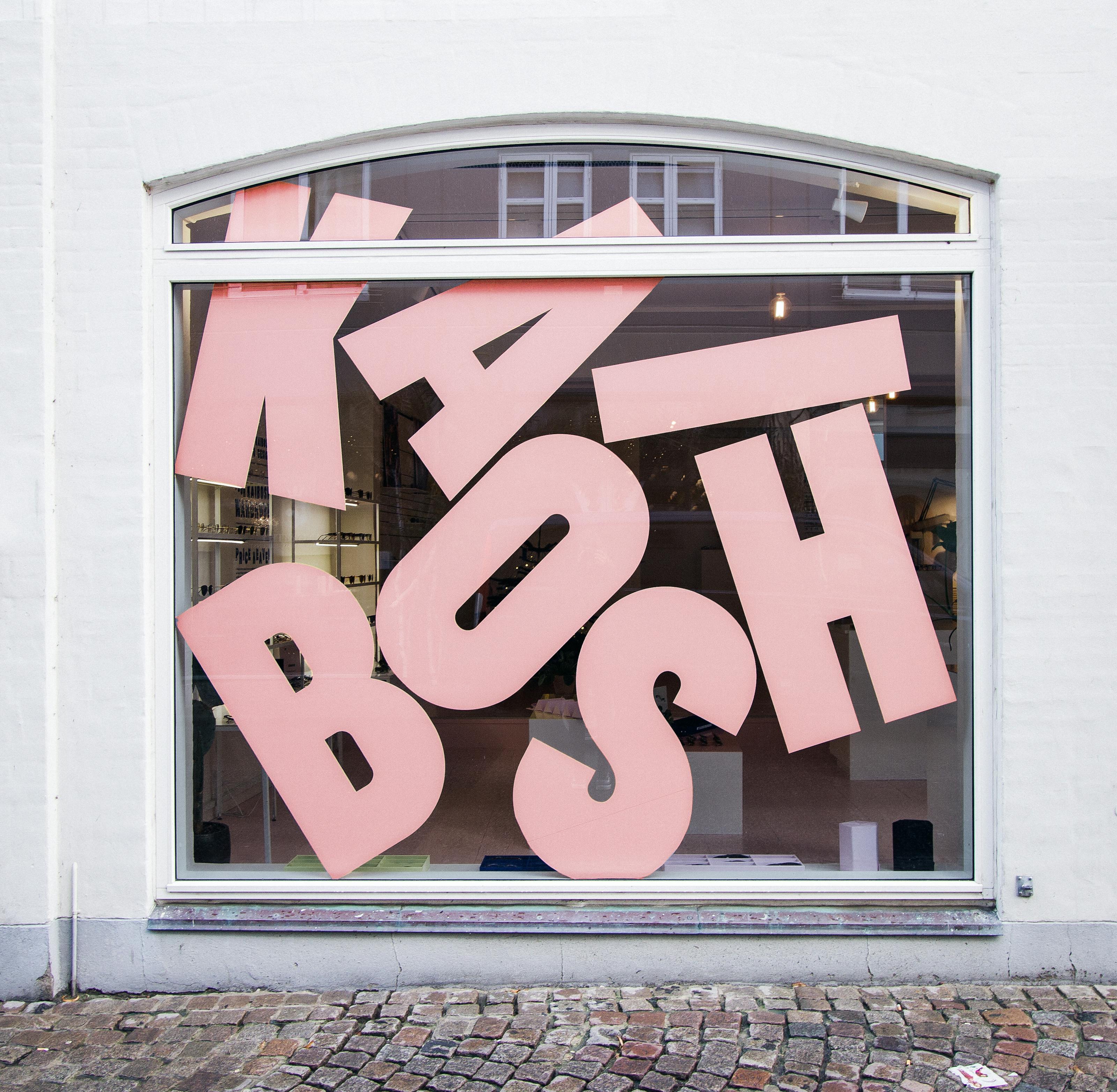
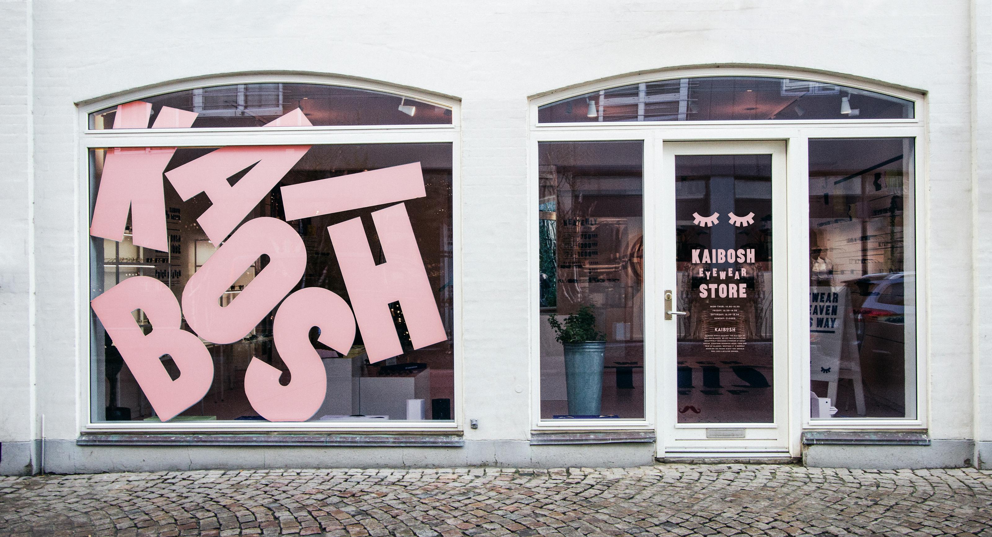
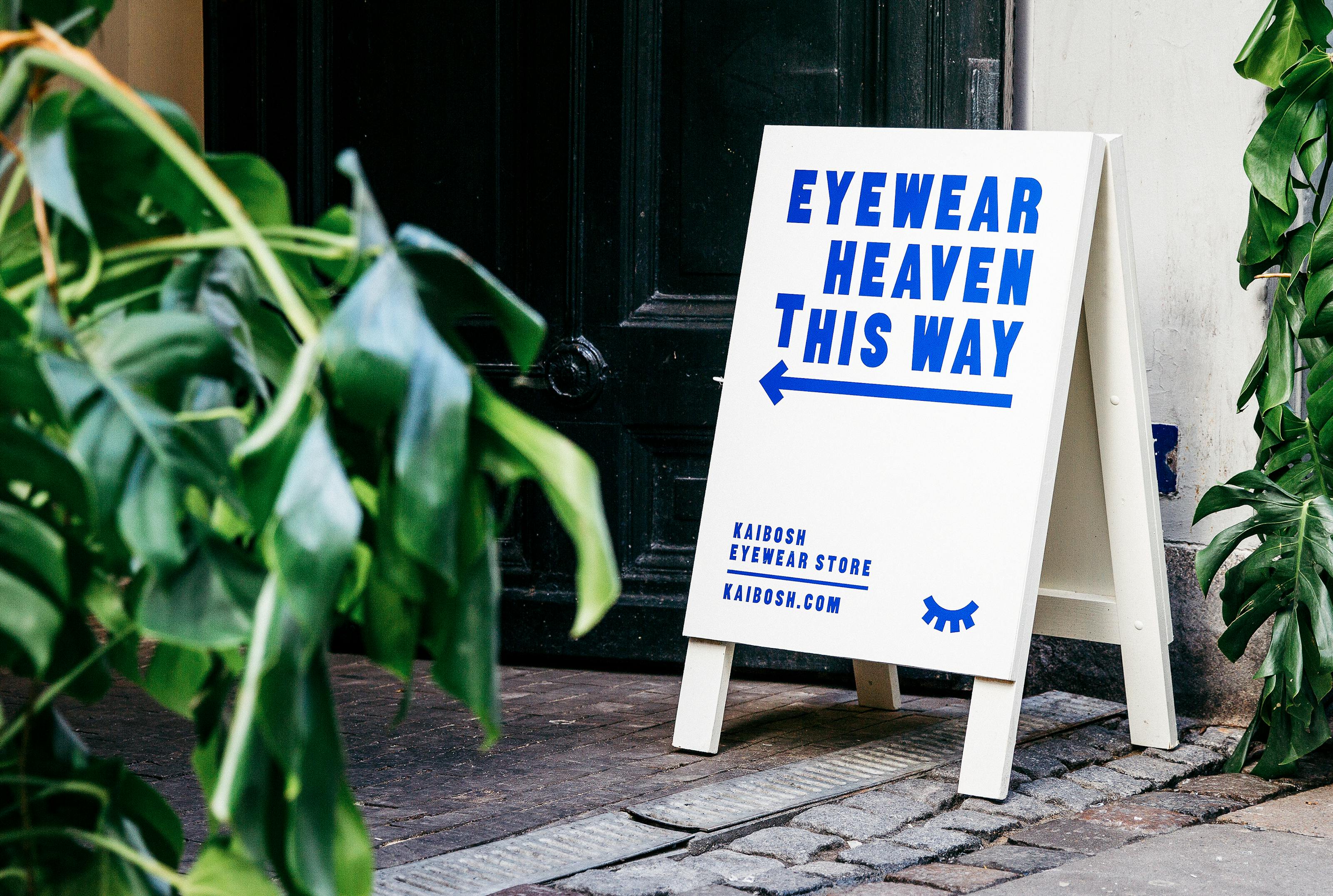
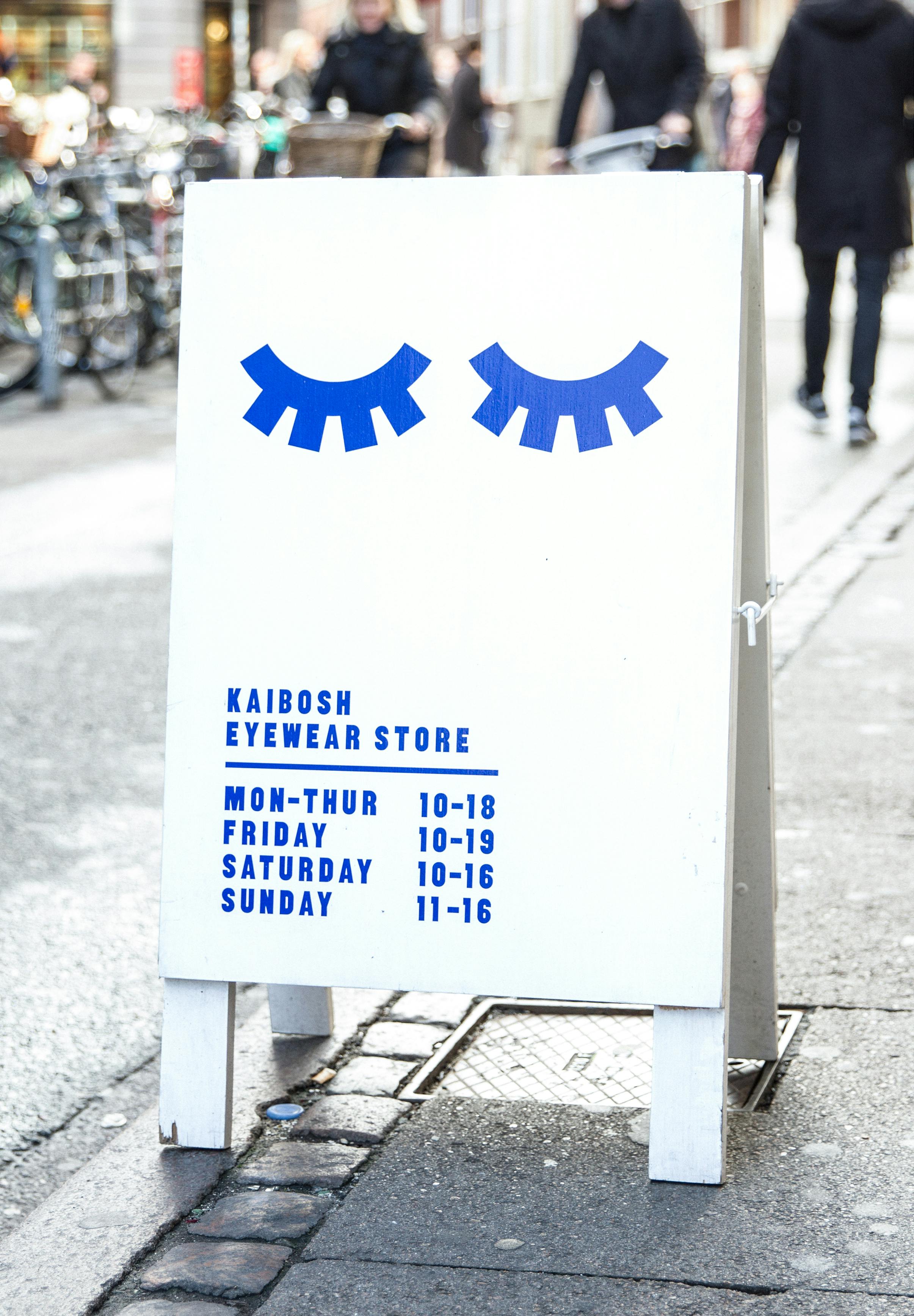
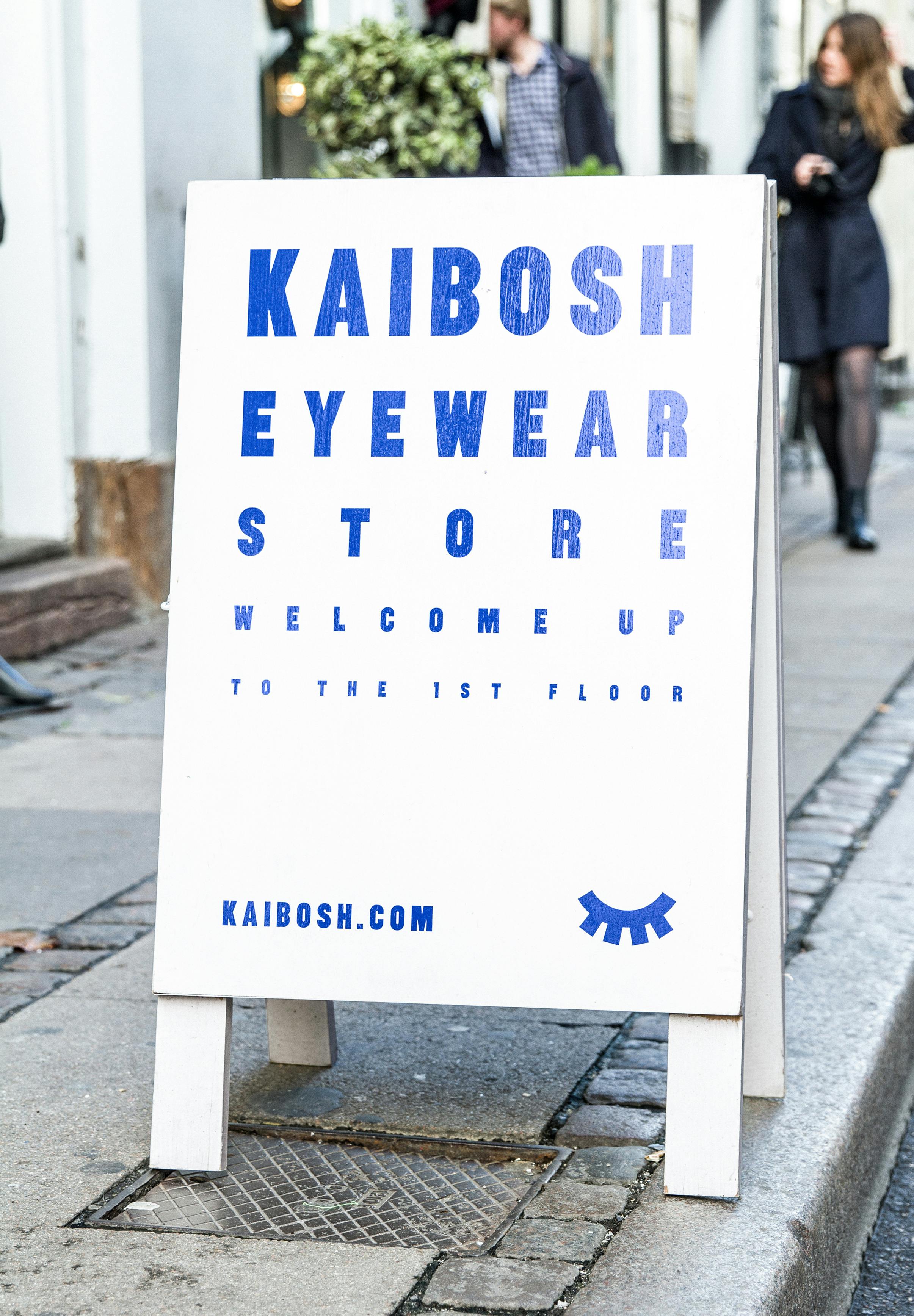
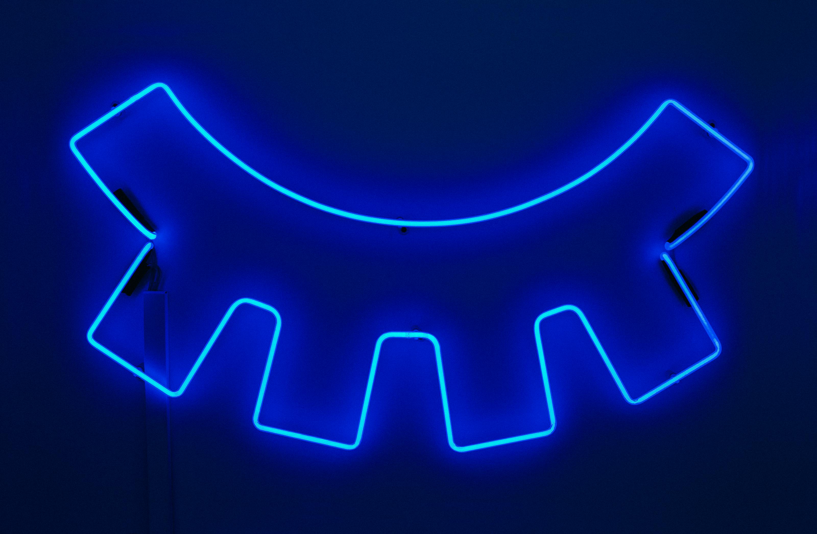
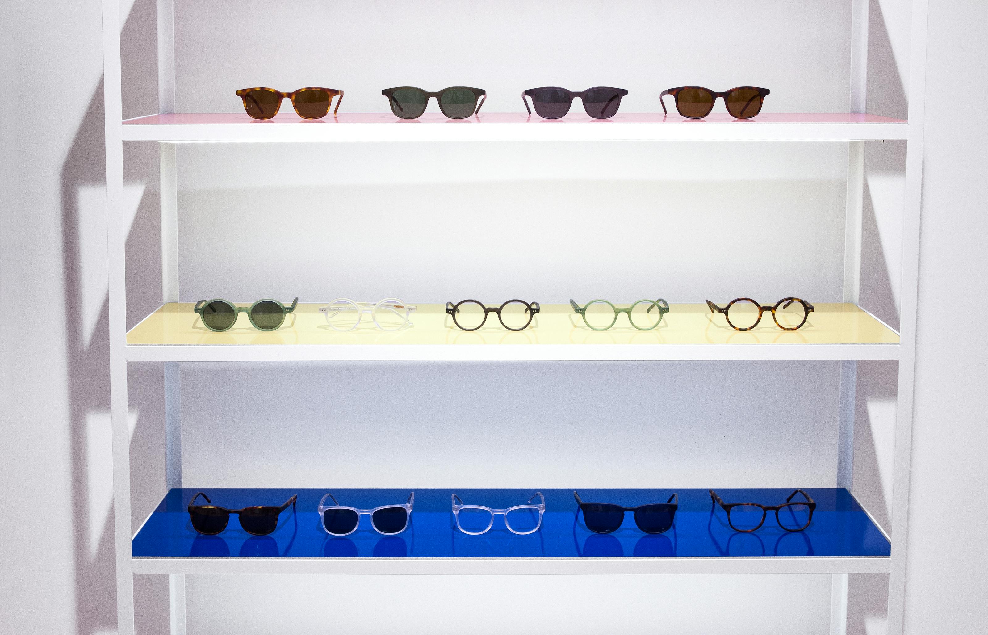
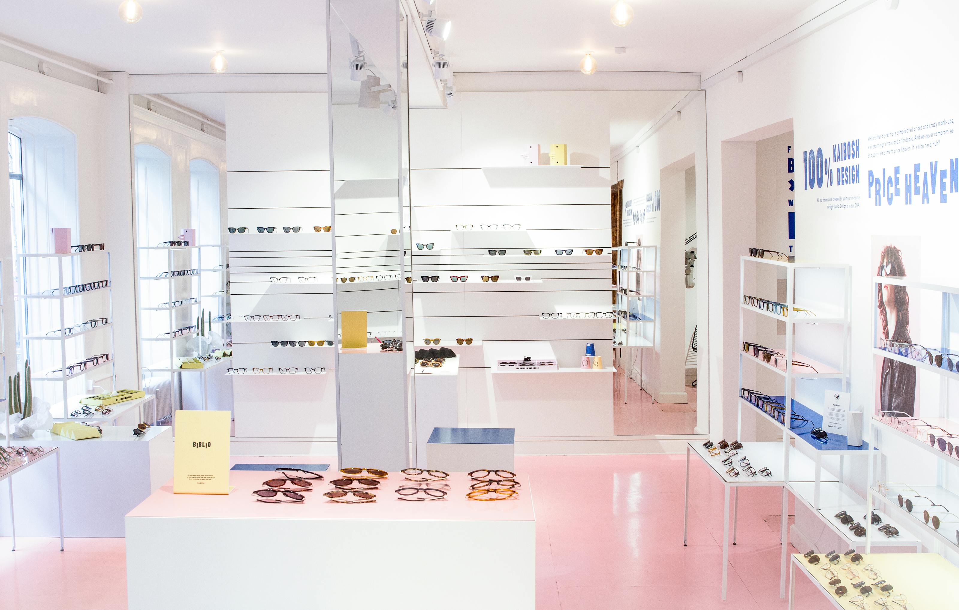
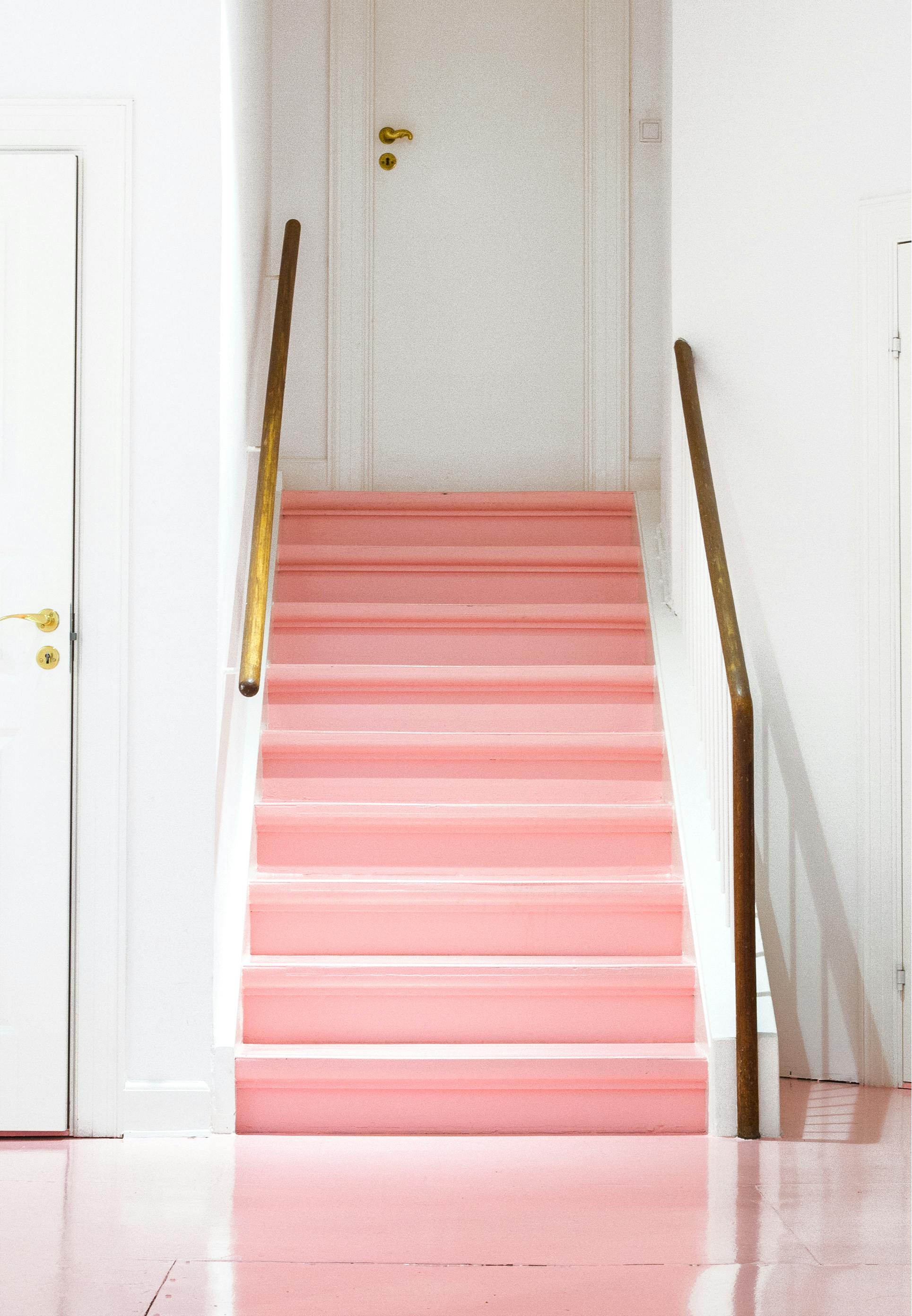
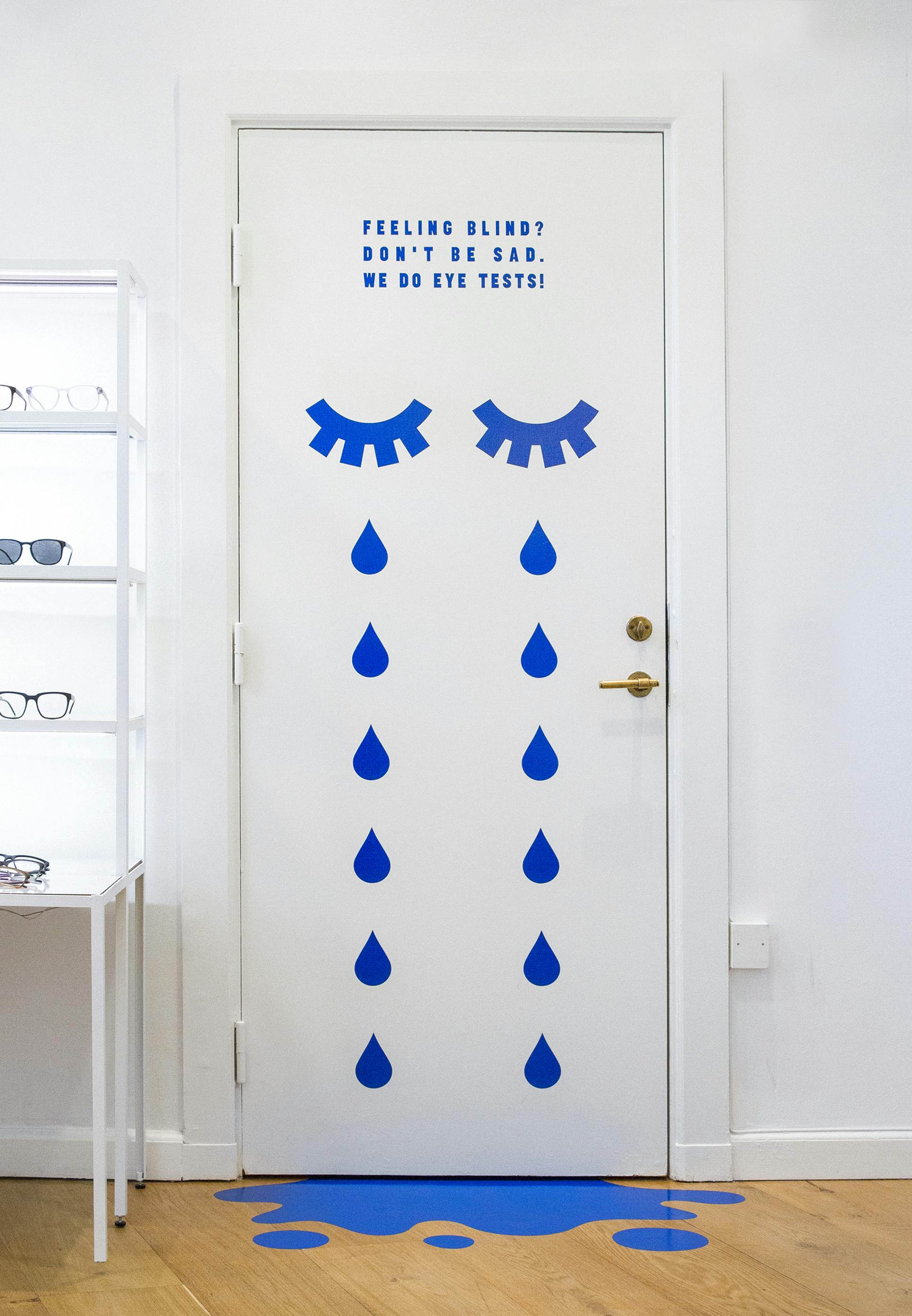
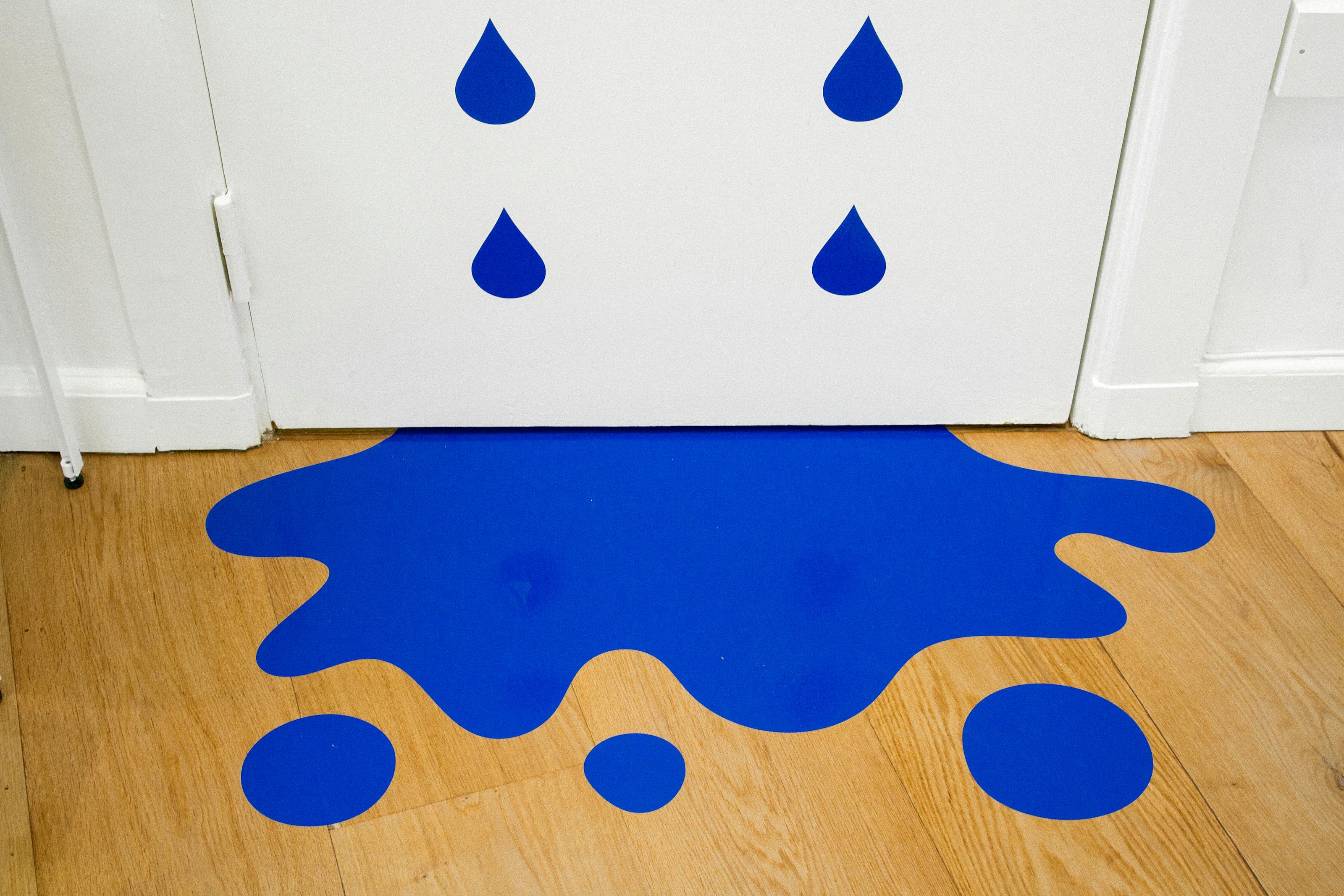
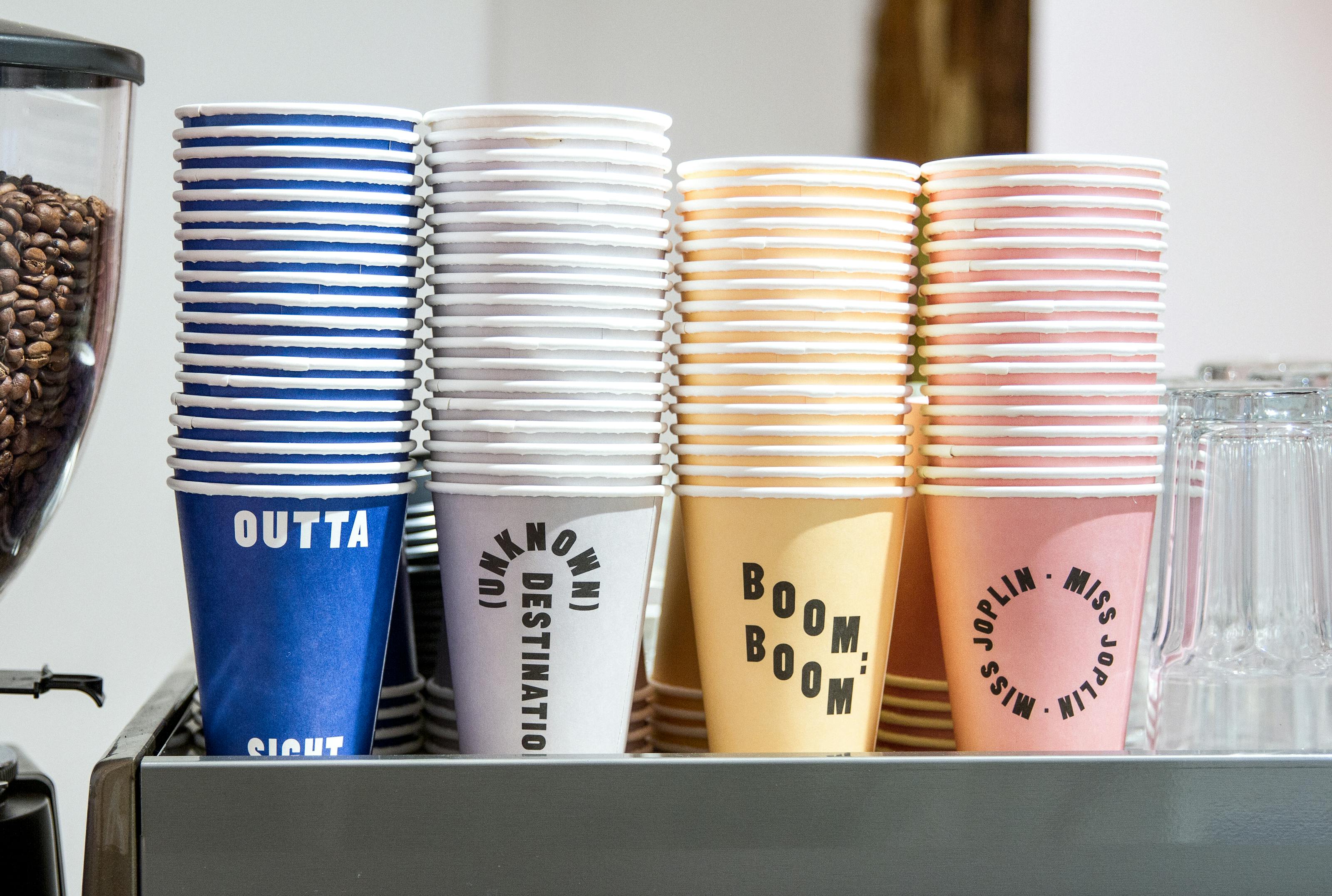
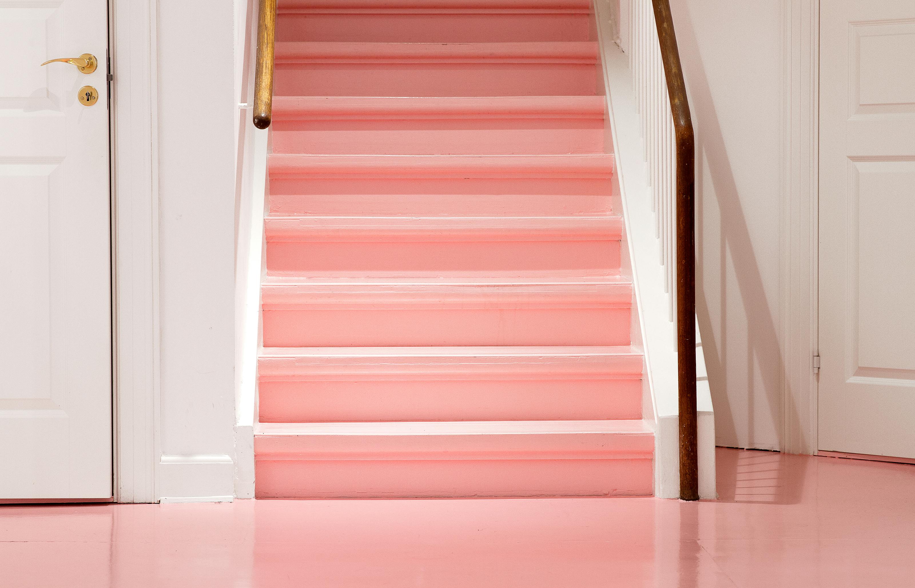
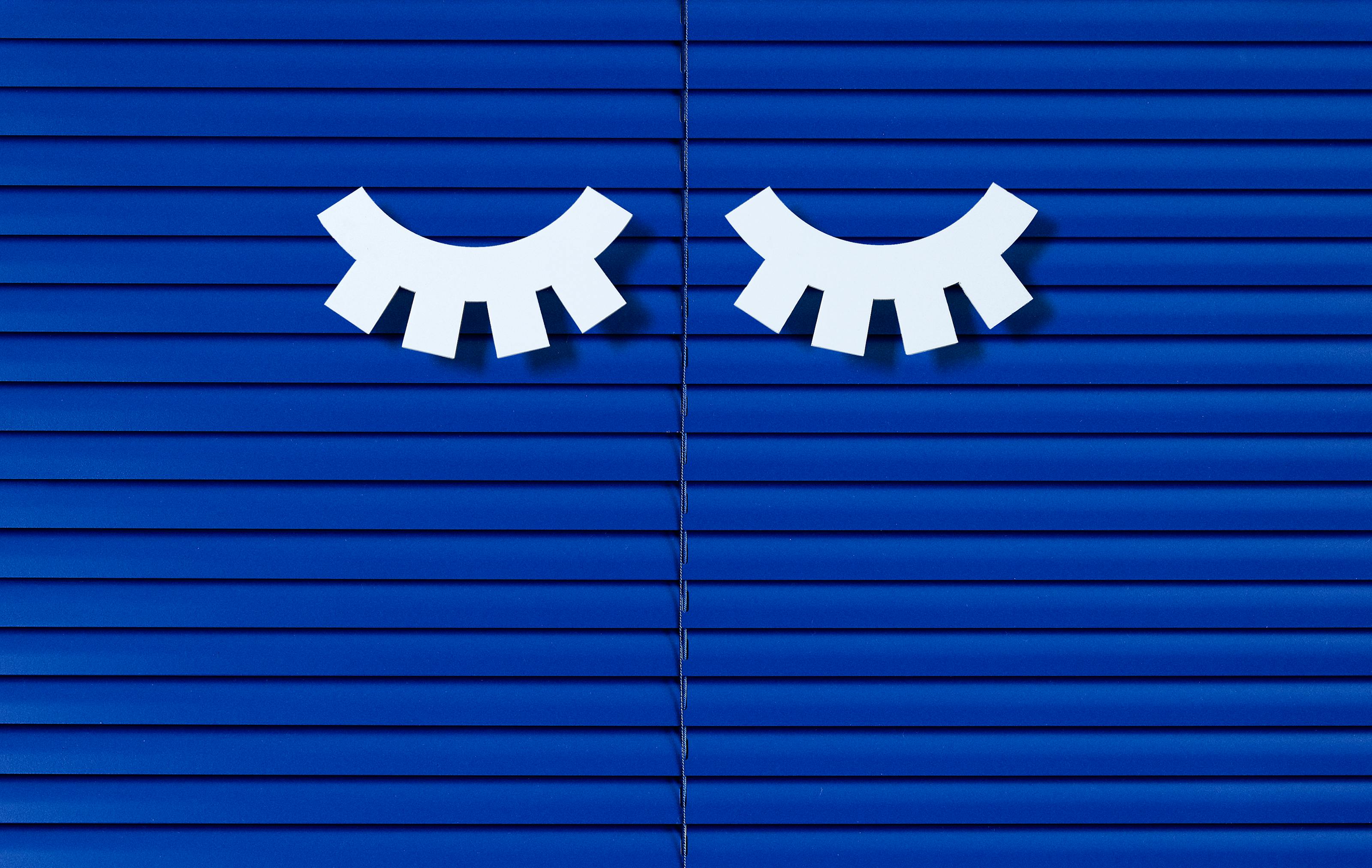
A full re-brand for the Norwegian eyewear company Kaibosh. This comprehensive overhaul included revamping the visual identity, store design, campaign development, imagery and more. By introducing a custom typeface named Sentrum together with the 2 distinctive eyelash icons, we injected boldness and expressiveness into Kaibosh's previously clean and minimal Scandinavian image.
The case has been written about by The Dieline, It's Nice That, Brand New, Creative Review and many more.
Art direction & Design: Jens Nilsson
Case, Still life & Fashion photography: Jens Nilsson
Created while working at Snask